

Label Design / Illustration / Photography / Prototype
Ramune Melon Flavour Label Redesign
Although Ramune (ラムネ) is targeted to children, many adults love the challenge and nostalgia of this unique beverage. This project was prompted by "What if we can take something cute and make it even more adorable?"

Challenge
How to make the Ramune label suitable for the Canadian market in terms of language and nutrition information regulations? How can we up the cute factor and flavour message?
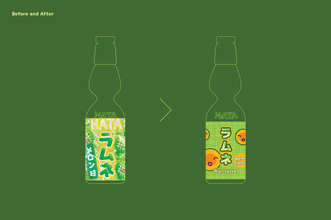
Solution
Captivated the customer with bubble-like typography details. Used saturated colours and updated the happy melon illustrations. Shortened the label to avoid wrinkling plastic which happened on the original bottle.


This is a fictional project and has nothing to do with the brand mentioned.
---
Ramune Melon Flavour Package Redesign
Resources
Hata Kosen Official Website, Otherness TV on Unsplash
Thank you for watching
Find more of my works on Instagram (@chiunery)


